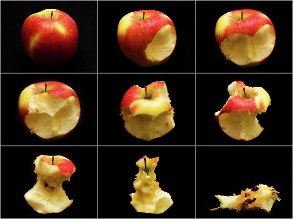
How to eat an apple – poster
Want to eat an apple? I’ll tell you how the easiest way 🙂
I’m not saying that you don’t know how to do it, but just in case, I made this poster with 9 easy steps, clearly shown. Everything it’s so much more feasible when it’s explained and especially when a schema is available… Right? 🙂
Here it is – don’t rush, but take your time…
I made it for a contest in a photography group. The moderator didn’t like the black background, but I didn’t change it – I think that the whole process on how to eat an apple is much more visible on black than on white, making the pieces standing out… what do you think?
Now, I don’t really know what was in my head when I made this poster so small, but if you want to keep it as reference, you can still have it. It will fit well above the counter of your kitchen, for example – this way you will be able to treat yourself with a healthy apple anytime, with no worries 😉
How to Eat and Apple poster
Click on the image for more info! it is also available as art print for your tote bag, or decorative items in your home, so you can have it handy every time you need it…
Oh, I almost forgot: the poster I made on How to eat an apple was possible after my visit to the Byward market in Ottawa, Canada.
This was a special organic apple that I bought at the market, and the hardest part of the project was done by my husband who ate it – he’s the vegan of the family 🙂
 … and if you really like red apples here is a big basket for you, from the same market, ready to hang in your dining room – I’m sure it will add some “Zest” to it… – Just click on it and you can have it all 🙂
Posted in WP challenges for:
Weekly Photo Challenge: The Color Red | Tuesday Photo Challenge: Treat | Lens-Artists Photo Challenge: Patterns | RDP #74: Zest | Cee’s Fun Foto Challenge: Red


Perfect! So creative!
Thank you Jenn 🙂
The black is certainly the only background for your poster, which is very lovely indeed 🙂
Thanks Hammad 🙂
Wonderful post for this week. Great idea. 😀
Thank you very much Christine! 🙂
That amazing I must try it! 🙂
Ha, ha… make sure you follow the exact steps 😉
Well done Tatiana! Love the black background
Thank you Tina, it feels good to know that I was right 🙂
The black background fits perfectly!
Thank you Ilka 🙂
I love it on black – makes it stand out and a great poster. Thank you for joining in the fun!
Thank you so much Leya 🙂
the nine grid layout of eating an apple is very striking and smart! love it!
What a fun and crazy poster. I agree it should be on black.